Death Rays and Disappearing Buttons: History’s Most Ridiculous Design Failures Revealed

Death Rays and Disappearing Buttons: History’s Most Ridiculous Design Failures Revealed · Avonetics

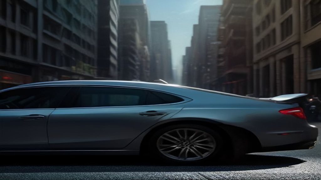
Imagine parking your luxury sports car on a quiet city street, heading into a lunch meeting, and returning two hours later to find your side mirrors turned into dripping puddle of plastic. That is not a scene from a science fiction movie. It is real life in downtown London, where a multi-million-dollar glass tower earned the terrifying nickname The Walkie Talkie—and the even more accurate title of Architectural Death Ray.
Designed by world-renowned architects, the 38-story concave building features a curved sweeping glass facade facing south. On sunny days, the convex curve transforms the entire tower into a massive parabolic mirror. The focused beam of light reflected off the windows reached temperatures exceeding 240 degrees Fahrenheit. It melted parked vehicles, scorched storefront carpets across the street, and spawned a viral wave of reporters frying eggs on the sidewalk.
 Read nextDEATH RAYS & EXPOSED SKIRTS: Inside the $120 Million Architectural Disaster That's Terrorizing Downtown!
Remarkably, this was not even the first time a curved glass skyscraper pulled off this trick. Just four years earlier in Las Vegas, another luxury hotel by the same architectural mind concentrated sunlight directly onto its outdoor pool deck. Sunbathers reported singed hair and melted plastic cups within minutes of lounging by the water.
While architects play with solar destruction in the physical world, software developers are waging a quieter war on human sanity in the digital realm. The culprit? Extreme flat design UI minimalism.
Over the last decade, app designers stripped away button borders, shadows, and clear visual cues in pursuit of clean visual aesthetics. The result has been a wave of high-profile digital disasters. Major platforms hid primary navigation menus behind tiny icons, causing user engagement to plummet. Important operational buttons vanished into grey background space, leading millions of users to accidentally confirm transfers or delete accounts.
Your brand, right here.Reach story-obsessed listeners in 45+ languages → advertise on AvoneticsOne digital critic points out that modern UI designers often design for their own design portfolios rather than actual human beings holding phones in bright daylight. Another reviewer notes that when design priority shifts entirely to minimalism, basic functionality becomes an afterthought.
Whether it is a 500-foot glass lens melting a Jaguar or a banking app hiding its cancel button, the underlying cause is always the same: immense ego combined with a refusal to test products in real-world conditions. When form completely abandons function, everyday people pay the price.
On the latest episode of Bad Blueprint, our hosts dig into these outrageous structural and digital disasters to determine who deserves the crown for worst design decision in history.