Death Ray Buildings and Balconies to Nowhere: The World’s Most Embarrassing Design Fails
Death Ray Buildings and Balconies to Nowhere: The World’s Most Embarrassing Design Fails · Avonetics
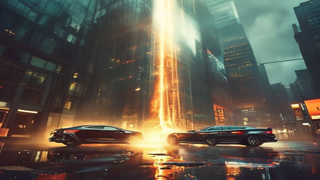
A towering glass skyscraper stands tall over a busy European financial district, gleaming in the bright mid-day sun. But down on the asphalt below, something bizarre and terrifying is happening. Smoke begins curling up from the side paneling of a luxury sports sedan. Within minutes, the side mirror distorts, melted plastic drips down the door frame, and bystanders gather to watch in utter disbelief.
This is not a scene from a science fiction blockbuster. It is the real-world legacy of 20 Fenchurch Street, a thirty-eight-story commercial tower in London affectionately known as the Walkie-Talkie building. Designed by a world-renowned architect, the structure features a sweeping concave glass facade that unexpectedly acts as a massive parabolic mirror. On bright days, the tower focuses intense solar radiation into a single ray capable of raising pavement temperatures to a blistering 243 degrees Fahrenheit.
 Read nextDEATH RAYS & EXPOSED SKIRTS: Inside the $120 Million Architectural Disaster That's Terrorizing Downtown!
Before city officials stepped in to install permanent shading louvers, the building’s thermal beam scorched nearby storefront carpets, shattered floor tiles, and melted vehicle trim. It remains one of the most famous architectural miscalculations in modern history, but it is far from an isolated incident.
Across the Atlantic, suburban residential developments face their own pandemic of absurd blueprints. Modern suburban housing developments are filled with homes that feature exterior doors opening into empty air two stories above the ground, structural support pillars planted directly in front of two-car garages, and interior staircases that require adults to duck beneath low-hanging ceilings.
Commenters online point out that these mistakes often stem from automated software tools where junior technicians drag and drop elements onto digital blueprints without ever cross-referencing vertical elevations. One observer noted that developers routinely print these plans and hand them directly to builders, who build them exactly as drawn without asking basic questions.
Your brand, right here.Reach story-obsessed listeners in 45+ languages → advertise on AvoneticsThe horror is not restricted to physical steel and concrete. Graphic design and software user interfaces frequently suffer from equally catastrophic oversights. When one major city hall unveiled a multi-million-dollar logo rebrand consisting of a single jagged blue line, citizens universally panned the expensive squiggle as looking like a biohazard symbol or a toddler's scribbles.
Even worse, bad user experience design can lead to real-world panic. The infamous 2018 statewide false missile alarm in Hawaii was triggered by an administrative UI that buried a live emergency broadcast option inside a crowded drop-down menu right next to a routine test option, complete with zero visual confirmation prompts.
Critics argue that these disasters stem from a toxic blend of corporate hubris, aggressive cost-cutting, and a total refusal to conduct simple usability testing with actual human beings before launching a product.
On this week’s episode of Bad Blueprint, the hosts tear down these catastrophic schematics, roast the ego-driven designers responsible, and debate who should actually take the blame when a building melts a sports car.